I've recently discovered this site called Venngage that lets you create your own data visualisations and graphs, either by using an already made template or by starting completely from scratch and making your own thing.
I decided to use my Brighton restaurant data from Tripadvisor and made a page of data visualisations from scratch. I'm not able to embed the html of the page in this post but you can access it HERE.
I've included a screen grab of the graph so you can see what it looks like but without the interactive part which is quite important to the understanding of the data.

The pie chart is interactive; when you hover over each coloured slice it tells you what type of cuisine it is representing and how many restaurants of that cuisine there are in Brighton.
UPDATE: unfortunately I discovered when recently testing out the link that Venggage has made some changes to my infographic and the pie chart no longer gives you the names of the different cuisines when you hover over each section. Instead I've added in a box underneath the pie chart to explain the colour coding, and when you hover over each different cuisine type in the box it should light up the section for that cuisine in the pie chart, making it easier for you to see which slice refers to which cuisine.
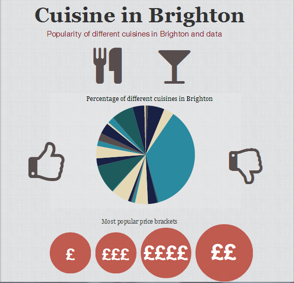
The '£' bubbles represent the different price brackets in relation to Brighton restaurants, and what percentage of restaurants fall under each price bracket. So, for example, most restaurants in Brighton are moderately cheap (represented by '££') and very expensive restaurants come in second (represented by '££££').

At the bottom of the page I've made a wordcloud consisting of the most popular dining options available for Brighton restaurants.
Please click on the link, or the first image, to be taken to the real graph so you can get a proper feel of it.
No comments:
Post a Comment